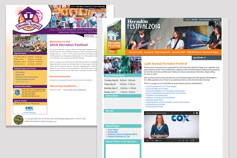
Recently, I worked with the Herndon Parks and Recreation Department to redesign the Herndon Festival website. This is the third time I’ve had the opportunity to work on the site. The original site was designed in 2009 and refreshed in 2014 to make it more mobile friendly. At that time we also used webfonts and designed for wider monitor widths.

This time we redesigned with the goal of creating a better, more modern user experience that takes into account the ways we now prefer imagery to words, enjoy videos, and have become accustomed to scrolling quickly down a page with our fingers on our touch screen devices.
Website Goals
Here are some of the goals of the redesign:
- must work well on mobile devices
- incorporate places to display more videos
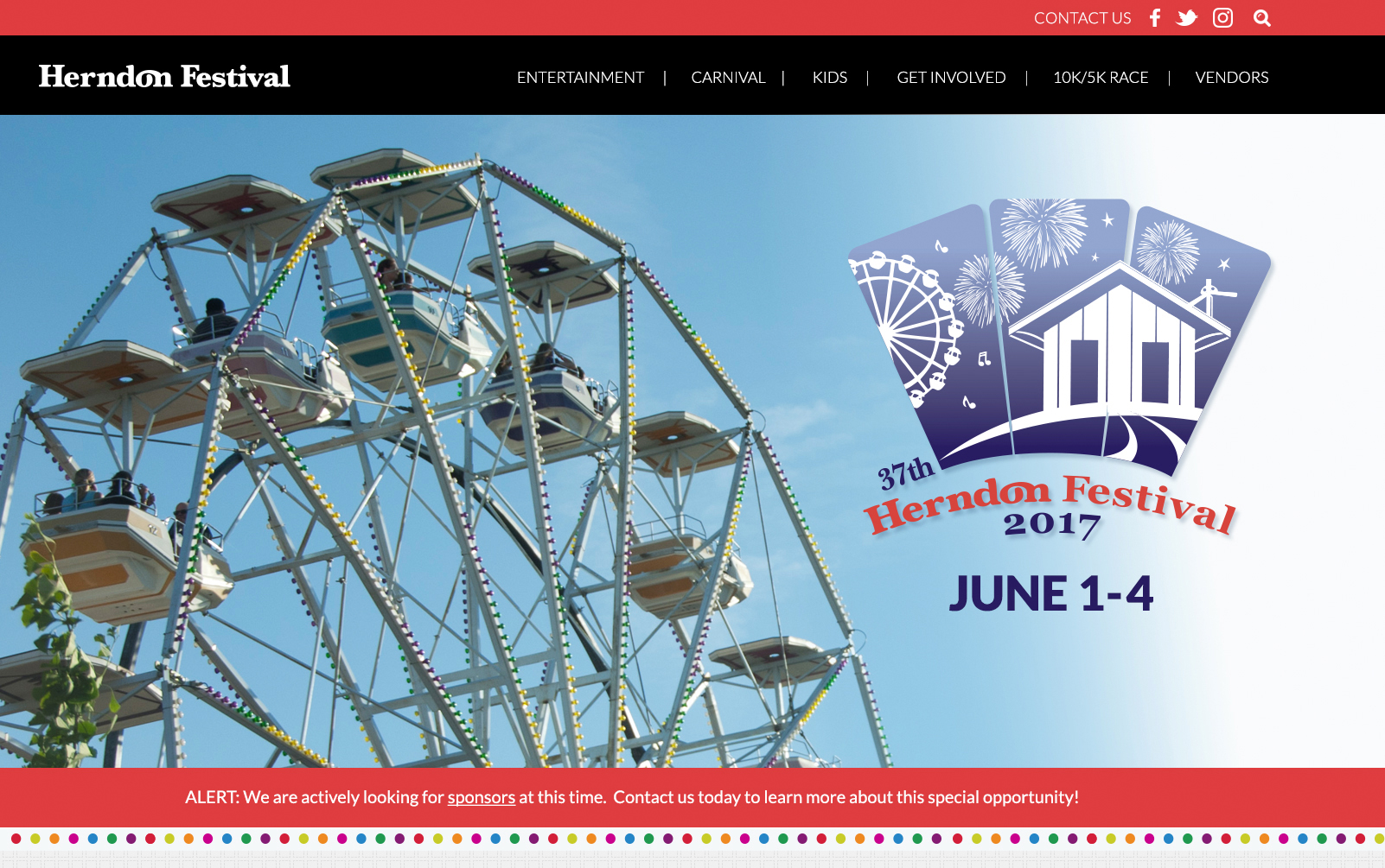
- easy to customize and incorporate a logo that changes annually
- improve navigation and user journey
- display social media feeds
- improve the display of entertainment information
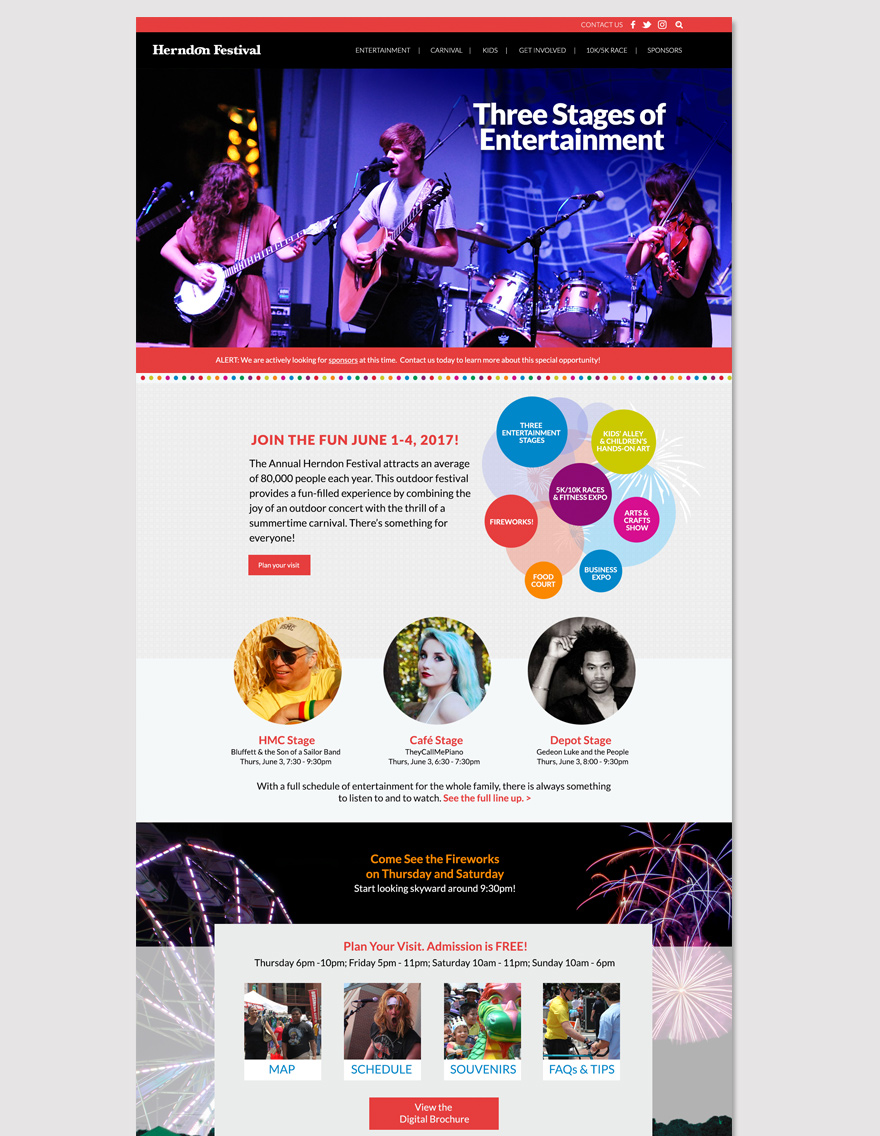
The design we came up with lets the user locate all of the key details very quickly as they scroll through the homepage. The top half of the page tells you why you should attend and introduces the different features of the festival such as the carnival, arts and crafts, show, and kids alley. A section where attendees can plan their visit lists the hours clearly and links to the map, schedule, info about souvenirs, FAQs and tips, and a digital brochure. Large photos of headline entertainment invite you to explore the full line-up.
Entertainment Section
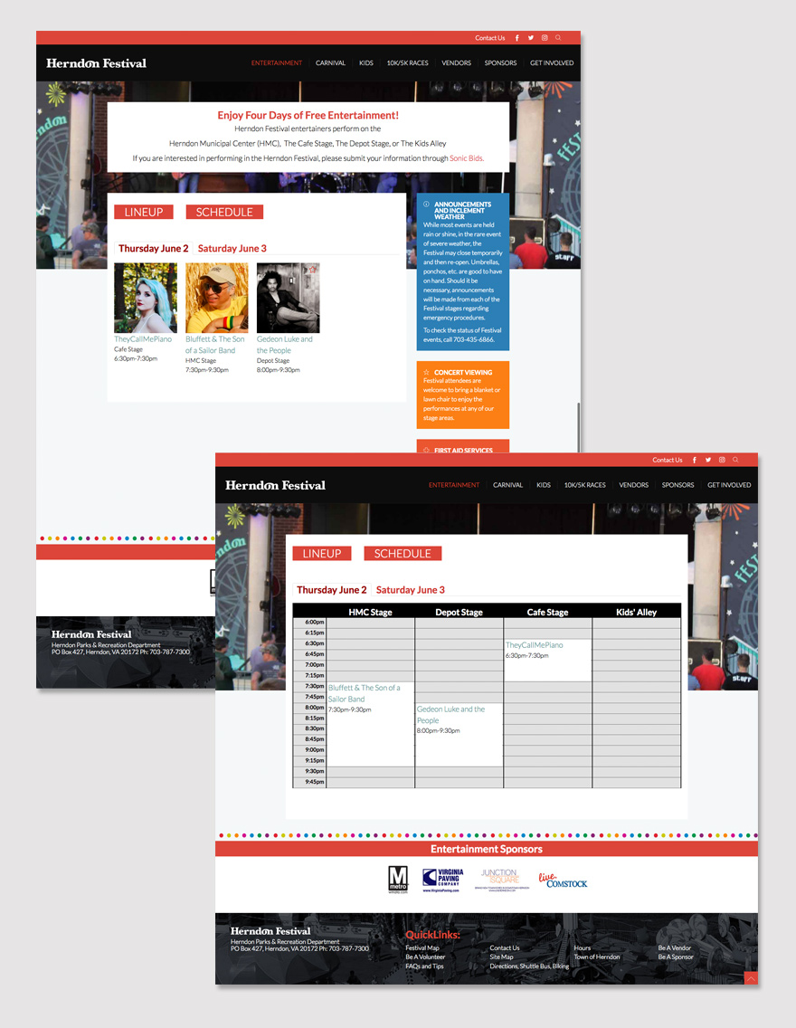
The entertainment lineup itself draws big crowds to this festival. So, we wanted to have the ability to showcase the acts in videos appearing on the home page. More videos can be seen as you drill down through the entertainment pages to see the details for each act. The site also features a way to view the lineup by day with photos of each act. Alternatively, you can view the lineup displayed on a grid with each act listed by time of day and one of 4 locations throughout the venue. This new feature will make it easier for attendees to plan out how they will spend their time at the festival.

This festival is the largest free festival in Northern Virginia. It’s a 4 day event with an average attendance of 80,000. Maybe I’ll see you there? Visit the site at www.herndonfestival.net
Dorothy and I brainstormed on how to improve the Herndon Festival website. Her vision for this project exceeded my expectations. She presented dynamic ideas and vibrant design concepts. With Don’s help (Katalyst Solutions) we were able to quickly implement a new Joomla template, while keeping all of our SEO. In addition, this project stayed within our budget. Both both Don and Dorothy are wonderful people to work with.


